

The logo
Logomark
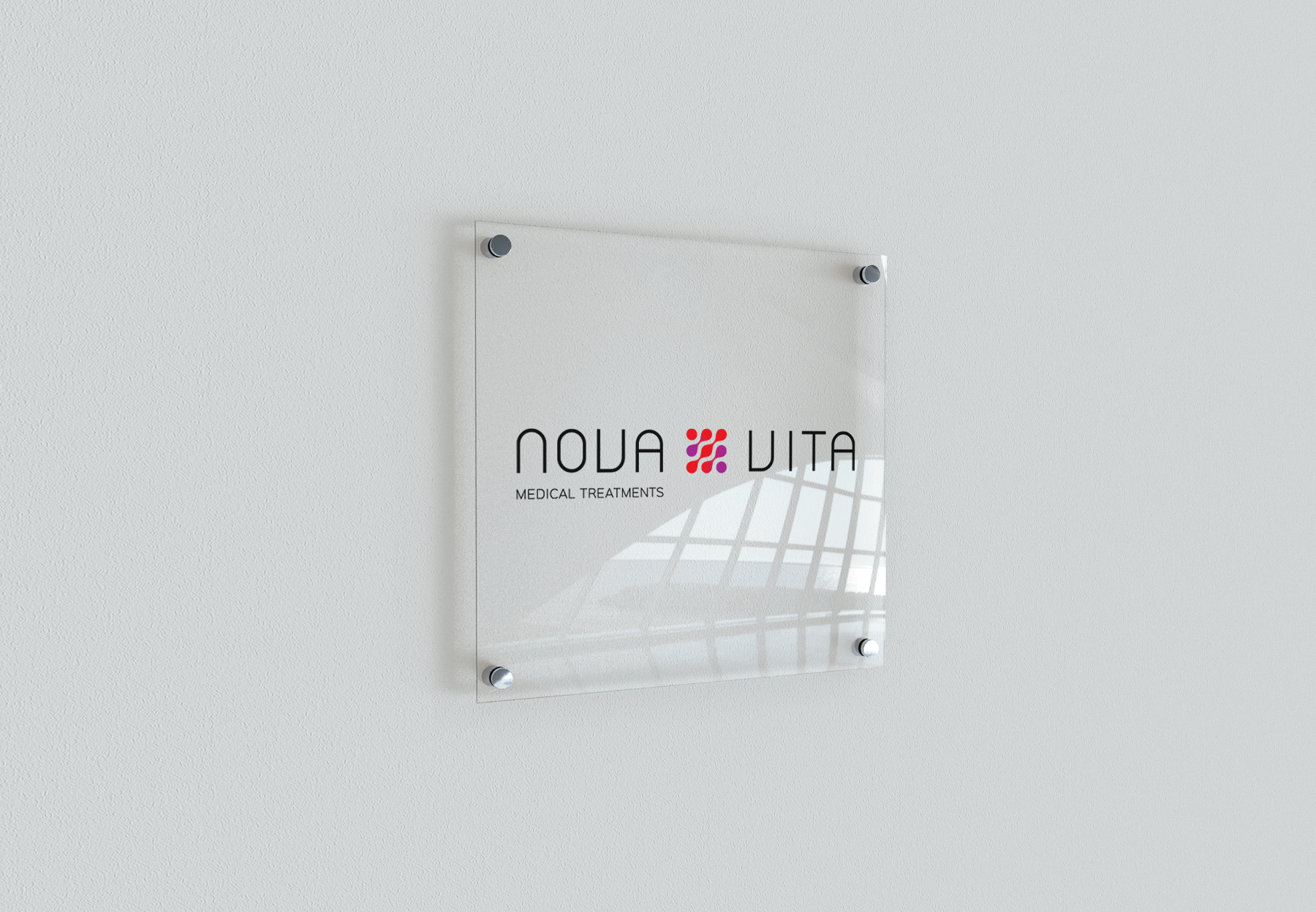
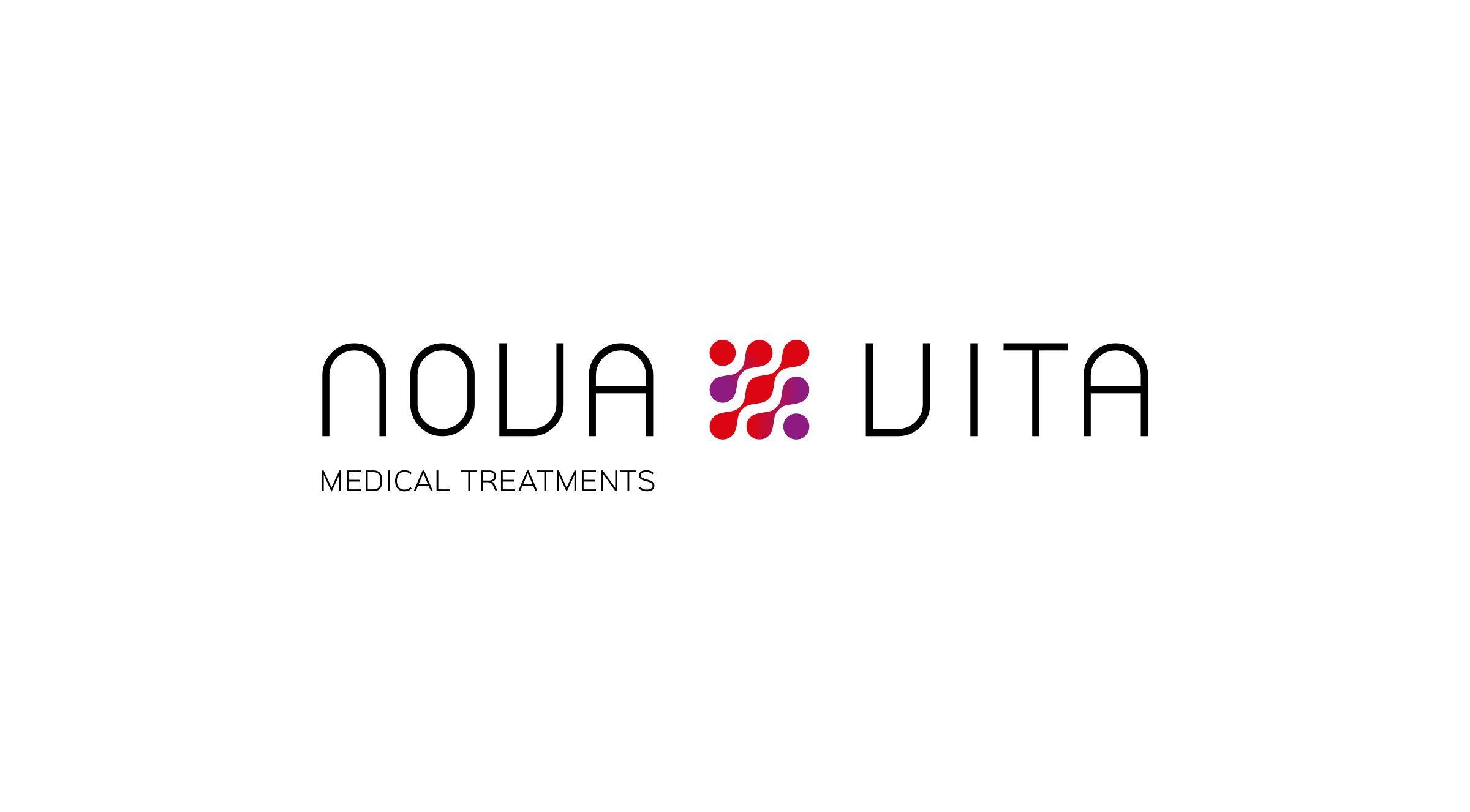
The logo
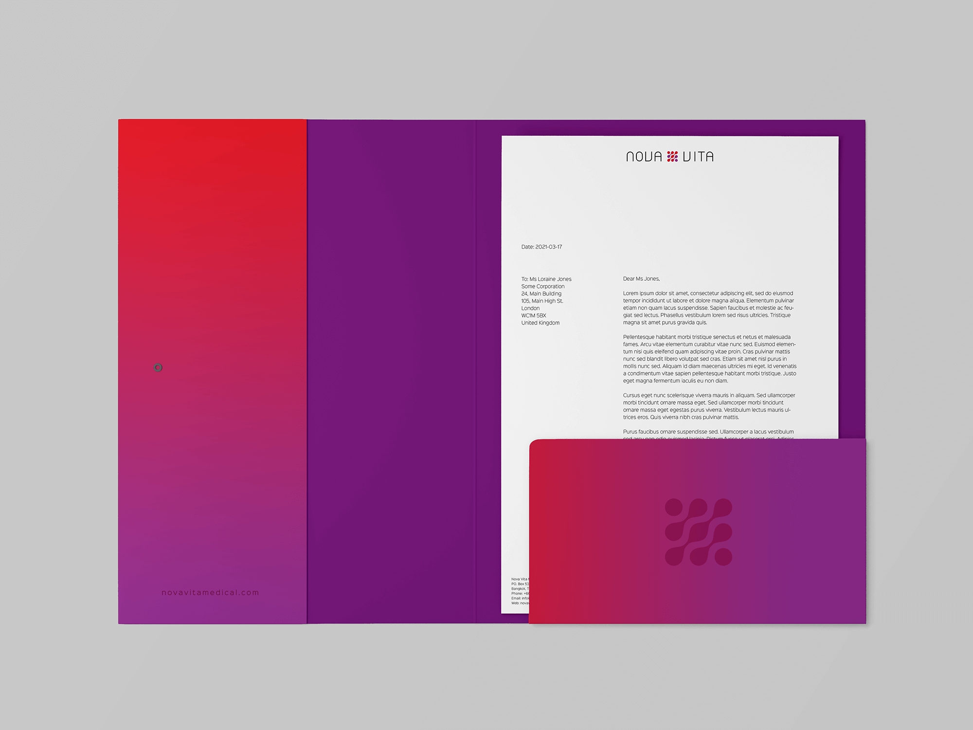
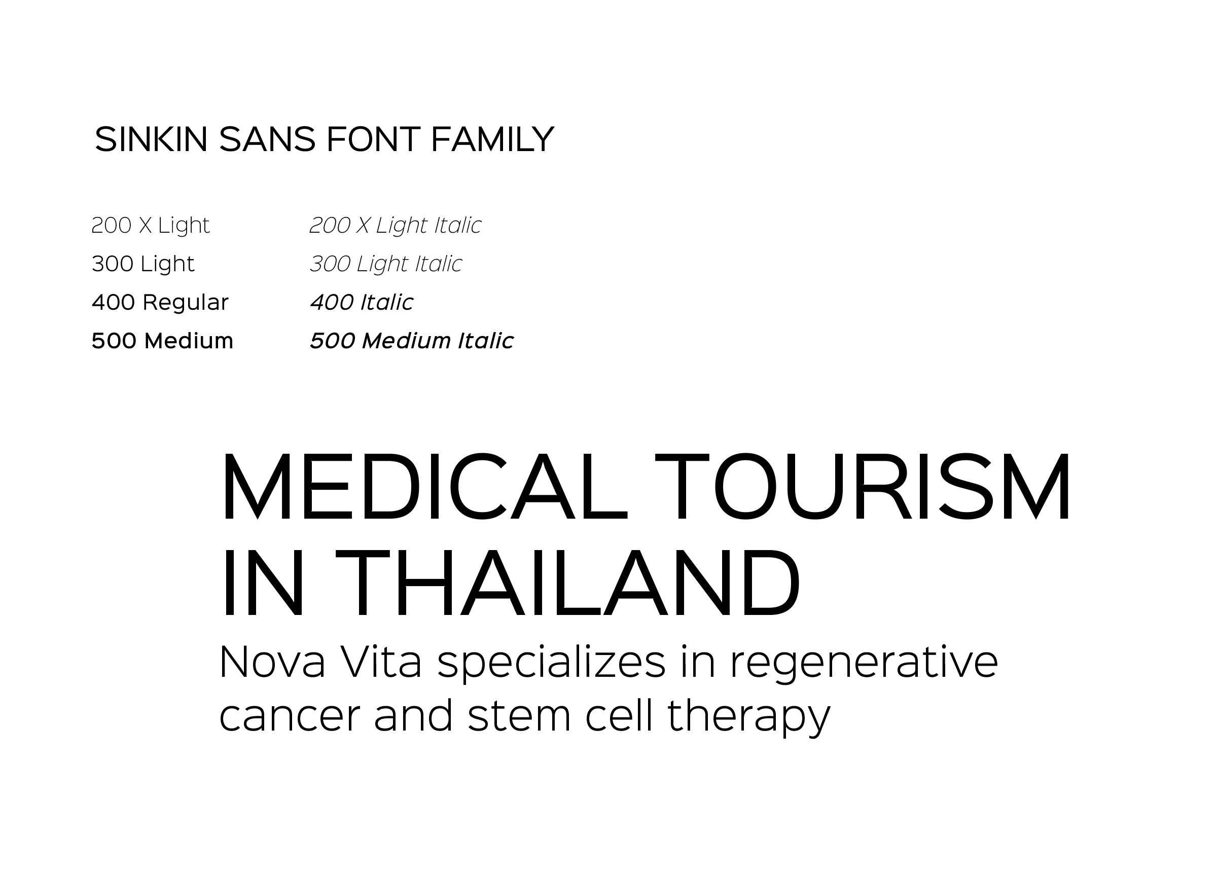
The logo has a friendly and approachable look with rounded simple lettering. I have used caps only for a feeling of authority and knowledge. The idea is to illustrate accessibility of advanced medical treatments for ordinary people.
Logomark
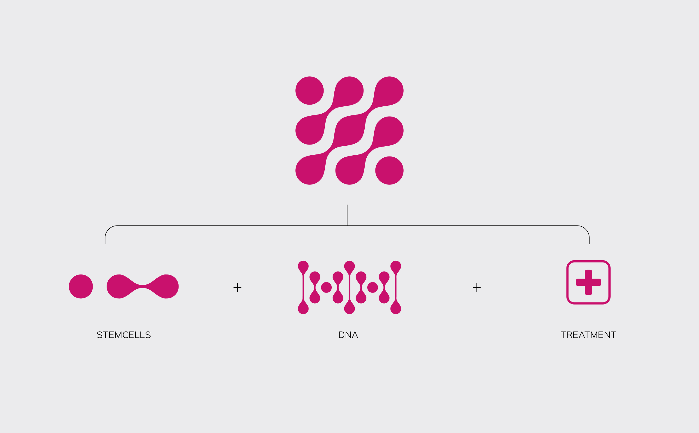
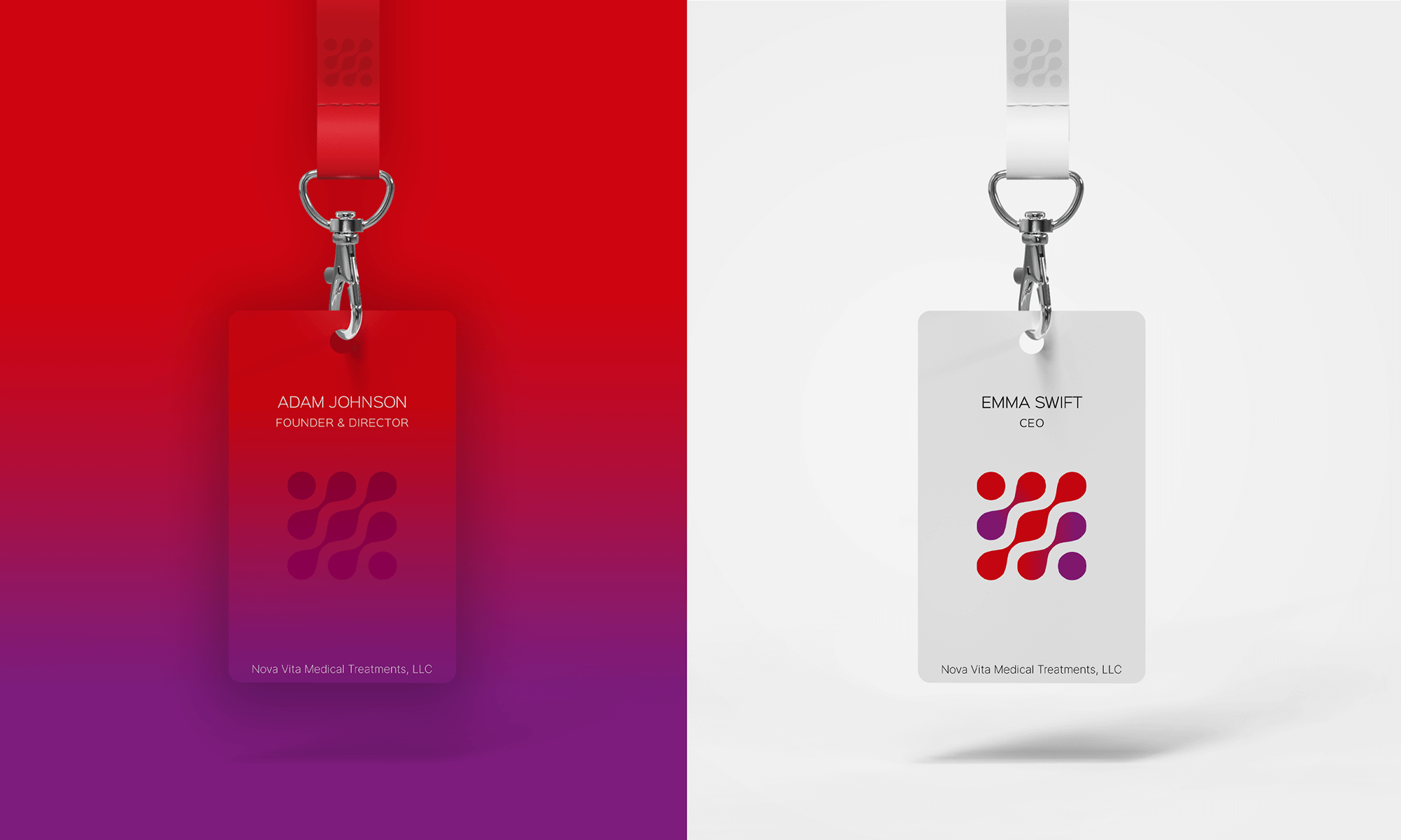
The shape of the logomark combines stemcells, DNA and an icon for medical treatment. It is placed between the two words in the logo as the treatment offers new life to people suffering from diseases previously difficult to treat and cure.
